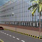
 From outside it looks pretty much the same- the deceptive box architecture. But this educational facility in the heart of Mumbai opens up for a complete redical re-think.
Designer architects : Planet 3 Studios
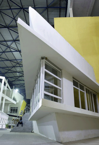
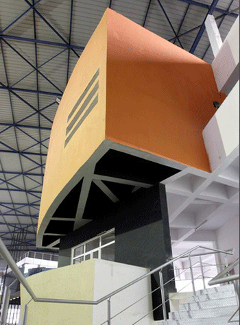
Here walls bend, curve and tilt to challenge accepted notions of structural stability. Orthogonal rigidity is eschewed. A cleverly designed porous polycarbonate skin allows the structure to be naturally aerated at all times.
The entire structure dispels pre-conceived notions of design and construction. Read about design patterns here.
If you think it is only a box of asymmetric spaces, go take a walk! It is a very complex design assimilating every possible need of a higher education facility and Much More!
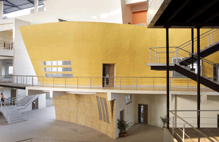
You are onto the learning street; Friends! Enter as the building does not have gates (!) only large punctures which connect inside with the outside.

The building architecture is devised as a group of distinct facilities (four engineering faculties) connected by a self guiding interior promenade with nooks and alcoves to accommodate student activities.


