harumo line
Designer : Shinichi Sumikawa
The absolute fluidity in his design forms is what draws me to this Tokyo based designer Shinichi Sumikawa’s work.
harumo line
Designer : Shinichi Sumikawa
The absolute fluidity in his design forms is what draws me to this Tokyo based designer Shinichi Sumikawa’s work.
golden happy waves in ocean of life
by bovinacowboy
What colour is the happiness? How it looks like? Where does it hide or flourish?
In pursuit of happiness I went to flickr and found these 10 brilliant faces of happiness.
I don’t want to name this anything but pure happiness
by Harraz
hearty hug
by Moranga
candle light
by Cvalentine
radioactive happiness – it is! -face it!
by netsrot
just kidding yaar!
(in Hindi-slang ‘yaar’ means friend)
let the sun shine in
by crazee-loki
lawful enlightnment
(it has beautiful meaning, go to the link and read it)
by cloudman82
wheels of life
(just adore this rich, old, spinning patina of life)
by Linee
the end of the garden, anyone?
by Zalita
Excellent photography and brilliant moments -I don’t want to miss any of these! When you click these links see their other photographs too. I promise you won’t be disappointed!
Lotus pond
Designer : Dipen Desai
Lotus Pond is a very unusal name for shoes with heels! Isn’t it?
It is always a delight to discover a young Indian designer’s work – varied, full of talent, sometimes teasing, sometimes posing new questions.
Lifestyle Trends research & Accessory Designer Dipen Desai likes to traverse the boundaries of art & design.
ebola
Now this is ebola, no, not the virus but a brilliant necklace-design.
What visual bliss other than having them (of course peacocks!) dancing around in my courtyard!
Architects designers: SE ARCH – Studio for environment and architecture
From vivid array of work done by SE ARCH team theses interior spaces have been chosen keeping in mind the traditional Indian exotic outlook.
Step inside through this columns and arches; an exotic world awaits you.
Those banana leaves should be on my dining table!
The meal is being served right here. But let me have an eyeful of these carvings first.
The Indian thali. Wow! I am going to get all 32 dishes!(traditionally 32 various dishes used to make a royal meal)
Satiated, I am going to laze in the courtyard. How can ikat be faraway.
Verandah has these jaislmer stones warmth but colours give a feel of amazing attangudi tiles.
Central courtyards always serve a purpose in extreme climates. They are so designed as to work as air shaft. Warm air rises and is let out at second level through ventilators and cooler breeze comes in through thinner slits and openings at the periphery of the house.
But I am thinking of 100 other ways to décor the courtyard!
If still not satiated go out, green grass is not at the other side of the fence!
From the series of small stories
Gouache on paper
Artist : B Manjunath Kamath
Via : Garnier Contemporary Arts
Hope we don’t iron us out!
(This is my interpretation.What is yours?)
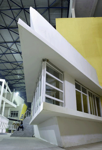
 From outside it looks pretty much the same- the deceptive box architecture. But this educational facility in the heart of Mumbai opens up for a complete redical re-think.
Designer architects : Planet 3 Studios
Here walls bend, curve and tilt to challenge accepted notions of structural stability. Orthogonal rigidity is eschewed. A cleverly designed porous polycarbonate skin allows the structure to be naturally aerated at all times.
The entire structure dispels pre-conceived notions of design and construction. Read about design patterns here.
If you think it is only a box of asymmetric spaces, go take a walk! It is a very complex design assimilating every possible need of a higher education facility and Much More!
You are onto the learning street; Friends! Enter as the building does not have gates (!) only large punctures which connect inside with the outside.

The building architecture is devised as a group of distinct facilities (four engineering faculties) connected by a self guiding interior promenade with nooks and alcoves to accommodate student activities.